
Some Context
The search function within the app hadn’t been updated in years. It was slow, didn’t show too many results and was limited in terms of what content types would show up.
The browse page, was also fragmented and lived in a different part of the app. An opourtunity arose when we had to add another feature to our tab bar and realized that we could merge the browse and search pages together to save space and upgrade the experience.
TEAM
Designers: Me, Vanessa H
User Research: Katherine R
Designers: Me, Vanessa H
User Research: Katherine R
Our current search was broken
Our current search was broken
The old search function was limited to just showing basic cases, however, the app had grown to support a number of different content types over the years that needed to show up in the search results.
Users can check-in weekly and the routine could be updated by the vet asyncly (without a live vet call) and can be updated weekly.
This would help our vets give a better sense of how a user is treating their pet and what lifestyle changes can be made to help mitigate certain (and common) issues.
We were hoping that this would also lead to more user engagement, as users would have to check-in every week in order to see if they’re routine is on track
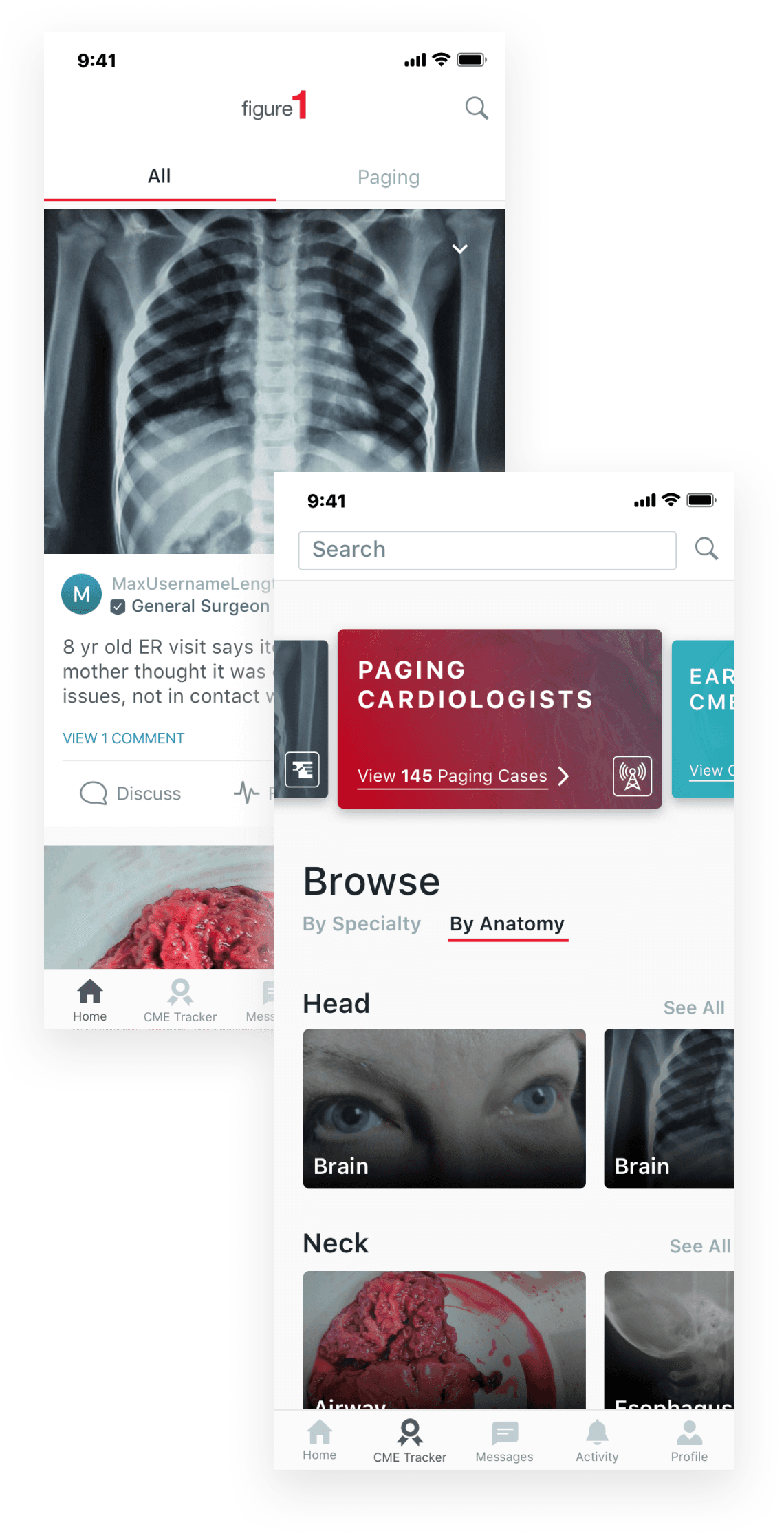
Combining Search and Browse
Combining Search and Browse
With the arival of our new CME Tab, we decided that it would be best to remove the "browse" button from the nav and combine it with search which could be found on the top right corner of our app.
Once in the search page, users can then browse by specialty, anatomy or even sort through paged cases.
With the arival of our new CME Tab, we decided that it would be best to remove the "browse" button from the nav and combine it with search which could be found on the top right corner of our app.
Once in the search page, users can then browse by specialty, anatomy or even sort through paged cases.
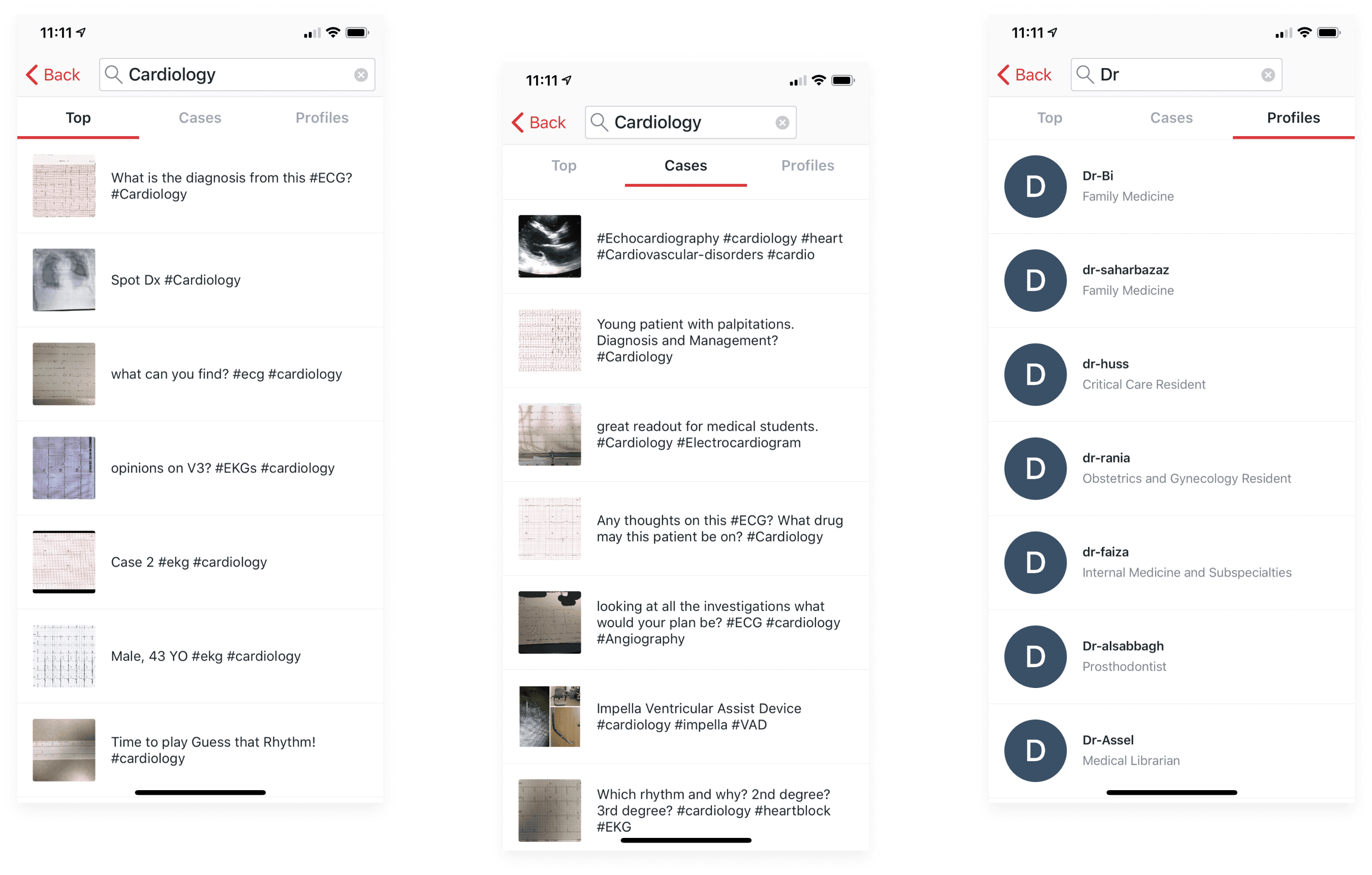
Updating Search Bar & Results
Updating Search Bar & Results
In terms of updating the actual search bar, we worked together with developers to see if we could implement a user's search history as well as the most popular searches happening within the app.
Of course, one of the most important items to update in this project were the actual search results. The original designs were only limited to showing cases in a list format. We wanted to make results more dynamic, by showcasing the top cases of all time, via comments, follows etc.

New search need to showthe new content types that we had
New search need to showthe new content types that we had
The original search feature hadn't grown with the app and the different types of content types developed over the years (quizzes, videos, etc). We needed to make sure thatthe new design could incorporate these new content types, but also be flexible for more in the coming future.
The original search feature hadn't grown with the app and the different types of content types developed over the years (quizzes, videos, etc). We needed to make sure thatthe new design could incorporate these new content types, but also be flexible for more in the coming future.

If a user clicked on the "see all CTA", they’d be redirected to this page that shows all the cases within that category. Unlike before, we added the full titles of the cases, along with a preview of the case description and number of comments.
If a user clicked on the "see all CTA", they’d be redirected to this page that shows all the cases within that category. Unlike before, we added the full titles of the cases, along with a preview of the case description and number of comments.

Full Flow
Full Flow
We presented our designs to stakeholders with different variations via printouts and got them to circle which versions (the concepts above) made the most sense from a development and strategy standpoint
We presented our designs to stakeholders with different variations via printouts and got them to circle which versions (the concepts above) made the most sense from a development and strategy standpoint


rileyco@live.com